Block Supports
The Block Supports API allows a block to opt in or out of certain core features.
Opting into any of these features will register additional attributes on the block and provide the UI to manipulate that attribute.
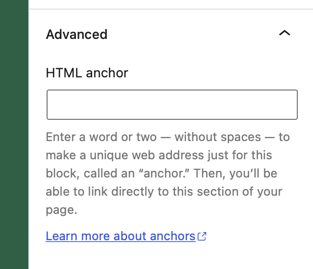
anchor
- Type:
boolean - Default value:
false
Anchors let you link directly to a specific block on a page. This property adds a field to define an id for the block and a button to copy the direct link.
As of WordPress 7.0, anchor support is fully wired up for dynamic blocks as well. The anchor value is now stored on the block comment delimiter and automatically applied to the wrapper attributes returned by get_block_wrapper_attributes() — no manual attribute or UI registration required for PHP-rendered blocks.
// Declare support for anchor links.
"supports": {
    "anchor": true
}
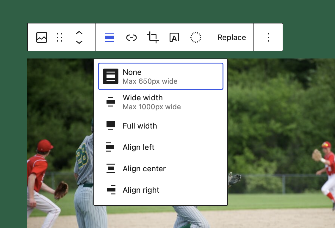
align
- Type:
booleanorarray - Default value:
false
This property adds block controls which allow to change block's alignment.
"supports": {
    // Declare support for block's alignment.
    // This adds support for all the options:
    // left, center, right, wide, and full.
    "align": true
}
"supports": {
    // Declare support for specific alignment options.
    "align": [ "left", "right", "full" ]
}
When the block declares support for align, the attributes definition is extended to include an align attribute with a string type. By default, no alignment is assigned. The block can apply a default alignment by specifying its own align attribute with a default e.g.:
"attributes": {
    "align": {
        "type": "string",
        "default": "right"
    }
}
alignWide
- Type:
boolean - Default value:
true
This property allows to enable wide alignment for your theme. To disable this behavior for a single block, set this flag to false.
"supports": {
    // Remove the support for wide alignment.
    "alignWide": false
}
ariaLabel
- Type:
boolean - Default value:
false
ARIA-labels let you define an accessible label for elements. This property allows enabling the definition of an aria-label for the block.
This option does not add any UI to the block editor. It is purely there for developers to add aria-label definitions to patterns, variations etc.
supports: {
	// Add the support for aria label attribute
	ariaLabel: true
}
background
Added in WordPress 6.4.
- Type:
Object - Default value: null
- Subproperties:
backgroundImage: typeboolean, default valuefalsebackgroundSize: typeboolean, default valuefalse(added in 6.5)
When enabled, the editor surfaces a background image control in the block's inspector. Setting backgroundSize to true adds a "Size" control (cover, contain, custom) alongside it.
"supports": {
    "background": {
        "backgroundImage": true,
        "backgroundSize":  true
    }
}
The selected values are written to the style.background.backgroundImage and style.background.backgroundSize attributes and end up as inline CSS on the block wrapper via get_block_wrapper_attributes().
blockHooks
Added in WordPress 6.4.
- Type:
Object - Default value: null
Block Hooks let a block declare that it should be auto-inserted relative to another block (typically a template part or a specific core block). The keys are the names of the blocks you want to attach to and the values are the insertion position.
Supported positions: before, after, firstChild, lastChild.
"blockHooks": {
    "core/post-content":   "after",
    "core/template-part/footer": "lastChild"
}
This is the recommended way to inject blocks like "Back to top", "Reading progress", or a "Cookie banner" without editing every template by hand. Editors can still remove or move the auto-inserted block from the list view.
className
- Type:
boolean - Default value:
true
By default, the class .wp-block-your-block-name is added to the root element of your saved markup. This helps having a consistent mechanism for styling blocks that themes and plugins can rely on. If, for whatever reason, a class is not desired on the markup, this functionality can be disabled.
In general it is recommended for consistency sake to stick with the core generated className
"supports": {
    // Remove the support for the generated className.
    "className": false
}
color
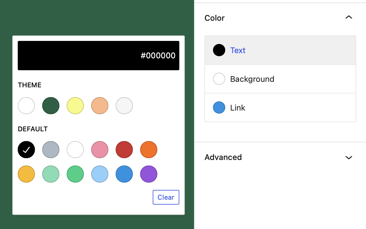
- Type:
Object - Default value: null
- Subproperties:
background: typeboolean, default valuetruebutton: typeboolean, default valuefalse(added in 6.5)caption: typeboolean, default valuefalse(added in 6.3)enableContrastChecker: typeboolean, default valuetrue(added in 6.5)gradients: typeboolean, default valuefalseheading: typeboolean, default valuefalse(added in 6.4)link: typeboolean, default valuefalsetext: typeboolean, default valuetrue
This value signals that a block supports some of the properties related to color. When it does, the block editor will show UI controls for the user to set their values.
In addition to the text/background/gradients/link controls described below, you can also expose color pickers that target semantic descendants of the block:
color.heading— styles anyh1–h6inside the block (great for hero/group blocks).color.button— styles anycore/buttoninside the block.color.caption— styles caption text on media blocks.color.enableContrastChecker— toggle the accessibility contrast checker that shows next to color pickers (defaulttrue).
Note that the background and text keys have a default value of true, so if the color property is present they'll also be considered enabled:
"supports": {
    "color": {
        // This also enables text and background UI controls.
        "gradients": true // Enable gradients UI control.
 }
}
It's possible to disable them individually:
"supports": {
    "color": { // Text UI control is enabled.
        "background": false, // Disable background UI control.
        "gradients": true // Enable gradients UI control.
    }
}
color.background
This property adds UI controls which allow the user to apply a solid background color to a block.
When color support is declared, this property is enabled by default (along with text), so simply setting color will enable background color.
"supports": {
    "color": true // Enables background and text
}
To disable background support while keeping other color supports enabled, set to false.
"supports": {
    "color": {
        // Disable background support. Text color support is still enabled.
        "background": false
    }
}
When the block declares support for color.background, the attributes definition is extended to include two new attributes: backgroundColor and style:
-
backgroundColor: attribute ofstringtype with no default assigned.When a user chooses from the list of preset background colors, the preset slug is stored in the
backgroundColorattribute.Background color presets are sourced from the
editor-color-palettetheme support.The block can apply a default preset background color by specifying its own attribute with a default e.g.:
attributes: {
    "backgroundColor": {
        "type": "string",
        "default": "some-preset-background-slug",
    }
} -
style: attribute ofobjecttype with no default assigned.When a custom background color is selected (i.e. using the custom color picker), the custom color value is stored in the
style.color.backgroundattribute.The block can apply a default custom background color by specifying its own attribute with a default e.g.:
"attributes": {
    "style": {
        "type": "object",
        "default": {
            "color": {
                "background": "#aabbcc",
            }
        }
    }
}
color.gradients
This property adds UI controls which allow the user to apply a gradient background to a block.
"supports": {
    "color": {
        "gradients": true,

        // Default values must be disabled if you don't want to use them with gradient.
        "background": false,
        "text": false
    }
}
Gradient presets are sourced from editor-gradient-presets theme support.
When the block declares support for color.gradient, the attributes definition is extended to include two new attributes: gradient and style:
-
gradient: attribute ofstringtype with no default assigned.When a user chooses from the list of preset gradients, the preset slug is stored in the
gradientattribute.The block can apply a default preset gradient by specifying its own attribute with a default e.g.:
"attributes": {
    "gradient": {
        "type": "string",
        "default": "some-preset-gradient-slug",
    }
} -
style: attribute ofobjecttype with no default assigned.When a custom gradient is selected (i.e. using the custom gradient picker), the custom gradient value is stored in the
style.color.gradientattribute.The block can apply a default custom gradient by specifying its own attribute with a default e.g.:
attributes: {
    "style": {
        "type": "object",
        "default": {
            "color": {
                "gradient": "linear-gradient(135deg,rgb(170,187,204) 0%,rgb(17,34,51) 100%)",
            }
        }
    }
}
color.link
This property adds block controls which allow the user to set link color in a block, link color is disabled by default.
"supports": {
    "color": true // Enables only background and text
}
To enable link color support, set to true.
"supports": {
    "color": {
        "link": true
    }
}
Link color presets are sourced from the editor-color-palette theme support.
When the block declares support for color.link, the attributes definition is extended to include two new attributes: linkColor and style:
-
linkColor: attribute ofstringtype with no default assigned.When a user chooses from the list of preset link colors, the preset slug is stored in the
linkColorattribute.The block can apply a default preset text color by specifying its own attribute with a default e.g.:
attributes: {
    "linkColor": {
        "type": "string",
        "default": "some-preset-link-color-slug",
    }
} -
style: attribute ofobjecttype with no default assigned.When a custom link color is selected (i.e. using the custom color picker), the custom color value is stored in the
style.color.linkattribute.The block can apply a default custom link color by specifying its own attribute with a default e.g.:
attributes: {
    "style": {
        "type": "object",
        "default": {
            "color": {
                "link": "#ff0000",
            }
        }
    }
}
color.text
This property adds block controls which allow the user to set text color in a block.
When color support is declared, this property is enabled by default (along with background), so simply setting color will enable text color.
"supports": {
    "color": true // Enables background and text, but not link.
}
To disable text color support while keeping other color supports enabled, set to false.
"supports": {
    "color": {
        // Disable text color support.
        "text": false
    }
}
Text color presets are sourced from the editor-color-palette theme support.
When the block declares support for color.text, the attributes definition is extended to include two new attributes: textColor and style:
-
textColor: attribute ofstringtype with no default assigned.When a user chooses from the list of preset text colors, the preset slug is stored in the
textColorattribute.The block can apply a default preset text color by specifying its own attribute with a default e.g.:
"attributes": {
    "textColor": {
        "type": "string",
        "default": "some-preset-text-color-slug",
    }
} -
style: attribute ofobjecttype with no default assigned.When a custom text color is selected (i.e. using the custom color picker), the custom color value is stored in the
style.color.textattribute.The block can apply a default custom text color by specifying its own attribute with a default e.g.:
"attributes": {
    "style": {
        "type": "object",
        "default": {
            "color": {
                "text": "#aabbcc",
            }
        }
    }
}
dimensions
- Type:
Object - Default value: null
- Subproperties:
aspectRatio: typeboolean, default valuefalseminHeight: typeboolean, default valuefalseheight: typeboolean, default valuefalse(added in WordPress 7.0)width: typeboolean, default valuefalse(added in WordPress 7.0)
This value signals that a block supports CSS dimensions. When it does, the block editor will show UI controls for the user to set their values, if the theme declares matching presets in settings.dimensions of theme.json.
"supports": {
    "dimensions": {
        "aspectRatio": true,
        "minHeight":   true,
        "height":      true,
        "width":       true
    }
}
WordPress 7.0 introduces dimensions.height and dimensions.width block supports along with reusable size presets in theme.json's settings.dimensions array. The Cover and Image blocks now also support aspect ratio for wide and full alignments.
customClassName
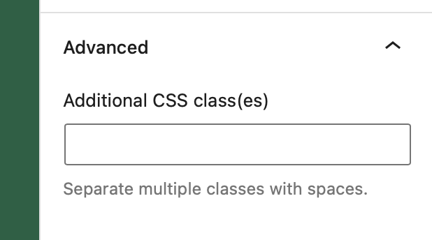
- Type:
boolean - Default value:
true
This property adds a field to define a custom className for the block's wrapper.
"supports": {
    // Remove the support for the custom className.
    "customClassName": false
}
defaultStylePicker
- Type:
boolean - Default value:
true
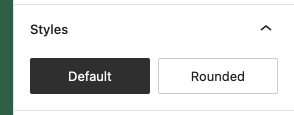
When the style picker is shown, the user can set a default style for a block type based on the block's currently active style. If you prefer not to make this option available, set this property to false.
"supports": {
    // Remove the Default Style picker.
    "defaultStylePicker": false
}
filter
Added in WordPress 5.9 (duotone). Promoted to the top-level filter support in 6.3.
- Type:
Object - Default value: null
- Subproperties:
duotone: typeboolean, default valuefalse
Enables a duotone color filter control. Themes can pre-define duotone presets via settings.color.duotone in theme.json.
"supports": {
    "filter": {
        "duotone": true
    }
}
To apply the generated filter on the frontend you also need to declare a CSS selector via selectors.filter.duotone in block.json:
"selectors": {
    "filter": {
        "duotone": ".wp-block-namespace-block img"
    }
}
html
- Type:
boolean - Default value:
true
By default, a block's markup can be edited individually. To disable this behavior, set html to false.
"supports": {
    // Remove support for an HTML mode.
    "html": false
}
inserter
- Type:
boolean - Default value:
true
By default, all blocks will appear in the inserter. To hide a block so that it can only be inserted programmatically, set inserter to false.
"supports": {
    // Hide this block from the inserter.
    "inserter": false
}
interactivity
Added in WordPress 6.5.
- Type:
booleanorObject - Default value:
false - Subproperties:
clientNavigation: typeboolean, default valuefalseinteractive: typeboolean, default valuefalse
Declares that the block uses the Interactivity API. Setting it to true is shorthand for { "interactive": true }. Setting clientNavigation opts the block into the upcoming client-side navigation transitions and tells WordPress that the block's markup is safe to swap during a navigation.
"supports": {
    "interactivity": {
        "interactive":       true,
        "clientNavigation":  true
    }
}
layout
Added in WordPress 5.8, expanded in 6.3.
- Type:
booleanorObject - Default value:
false
Layout support lets a block participate in the Flow / Flex / Grid layout system that powers core/group, core/columns, and similar containers. When enabled, the editor shows the layout panel in the inspector and applies the matching layout styles to inner blocks.
"supports": {
    "layout": {
        "default": { "type": "constrained" },
        "allowSwitching":     false,
        "allowInheriting":    true,
        "allowEditing":       true,
        "allowSizingOnChildren": true
    }
}
Available layout types include default (flow), constrained, flex, and grid. The constrained layout is the recommended replacement for the legacy contentSize / wideSize align behavior.
listView
- Type:
boolean - Default value:
false
Added in WordPress 7.0.
Declaring "listView": true tells the editor that this block — and its inner blocks — should be discoverable in the List View for contentOnly patterns. This is the recommended way for custom blocks to surface their nested structure to editors who are working inside Pattern editing mode without exposing the full block design controls.
"supports": {
    "listView": true
}
multiple
- Type:
boolean - Default value:
true
A non-multiple block can be inserted into each post, one time only. For example, the built-in 'More' block cannot be inserted again if it already exists in the post being edited. A non-multiple block's icon is automatically dimmed (disabled) to prevent multiple instances.
"supports": {
    // Use the block just once per post
    "multiple": false
}
position
Added in WordPress 6.2.
- Type:
Object - Default value: null
- Subproperties:
sticky: typeboolean, default valuefalse
Exposes a "Position" control in the inspector with a Sticky option. Only the outermost block of a template/template-part can become sticky — usually this is the header.
"supports": {
    "position": {
        "sticky": true
    }
}
renaming
Added in WordPress 6.5.
- Type:
boolean - Default value:
true
By default editors can rename a block instance via the List View / block options menu. Set to false to disable renaming for a specific block.
"supports": {
    "renaming": false
}
reusable
- Type:
boolean - Default value:
true
A block may want to disable the ability of being converted into a reusable block. By default all blocks can be converted to a reusable block. If supports reusable is set to false, the option to convert the block into a reusable block will not appear.
"supports": {
    // Don't allow the block to be converted into a reusable block.
    "reusable": false,
}
lock
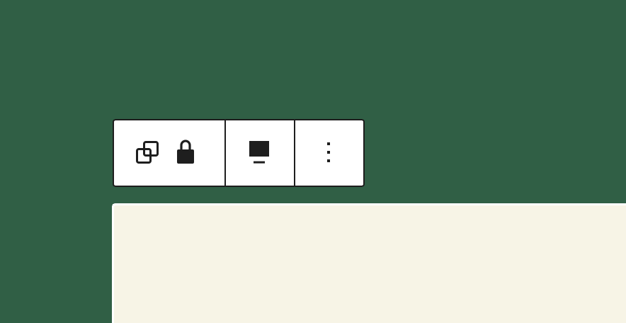
- Type:
boolean - Default value:
true
A block may want to disable the ability to toggle the lock state. It can be locked/unlocked by a user from the block "Options" dropdown by default. To disable this behavior, set lock to false.
supports: {
	// Remove support for locking UI.
	lock: false
}
shadow
Added in WordPress 6.3.
- Type:
boolean - Default value:
false
Adds a box-shadow control in the inspector. The selectable shadow presets come from settings.shadow.presets in theme.json.
"supports": {
    "shadow": true
}
splitting
Added in WordPress 6.5.
- Type:
boolean - Default value:
false
Allows the block to be split into multiple blocks when the user presses Enter inside it (the way core/paragraph and core/list-item already behave). The block must implement the splitting filter / handler in its edit component.
"supports": {
    "splitting": true
}
spacing
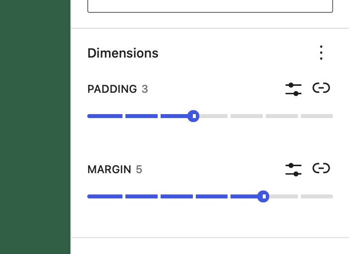
- Type:
Object - Default value: null
- Subproperties:
margin: typebooleanorarray, default valuefalsepadding: typebooleanorarray, default valuefalseblockGap: typebooleanorarray, default valuefalse
This value signals that a block supports some of the CSS style properties related to spacing. When it does, the block editor will show UI controls for the user to set their values, if the theme declares support.
"supports": {
    "spacing": {
        "margin": true,  // Enable margin UI control.
        "padding": true, // Enable padding UI control.
		"blockGap": true,  // Enables block spacing UI control.
    }
}
When the block declares support for a specific spacing property, the attributes definition is extended to include the style attribute.
style: attribute ofobjecttype with no default assigned. This is added whenmarginorpaddingsupport is declared. It stores the custom values set by the user.
"supports": {
    "spacing": {
        "margin": [ "top", "bottom" ], // Enable margin for arbitrary sides.
        "padding": true,               // Enable padding for all sides.
		"blockGap": [ "horizontal", "vertical" ],  // Enables axial (column/row) block spacing controls
    }
}
A spacing property may define an array of allowable sides that can be configured. When arbitrary sides are defined only UI controls for those sides are displayed. Axial sides are defined with the vertical and horizontal terms, and display a single UI control for each axial pair (for example, vertical controls both the top and bottom sides). A spacing property may support arbitrary individual sides or axial sides, but not a mix of both.
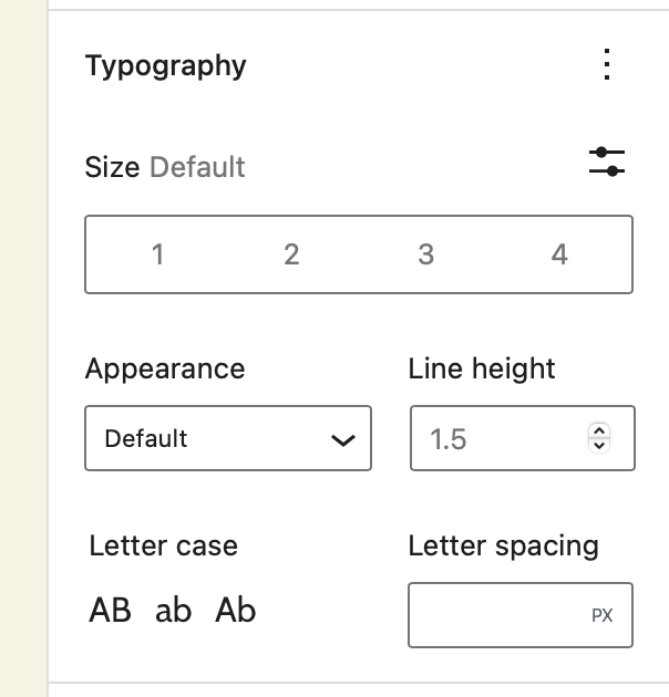
typography
- Type:
Object - Default value:
null - Subproperties:
fontSize: typeboolean, default valuefalsefontFamily: typeboolean, default valuefalse(added in 5.9)fontStyle: typeboolean, default valuefalse(added in 6.1)fontWeight: typeboolean, default valuefalse(added in 6.1)letterSpacing: typeboolean, default valuefalse(added in 6.1)lineHeight: typeboolean, default valuefalsetextAlign: typebooleanorarray, default valuefalse(added in 6.6)textColumns: typeboolean, default valuefalse(added in 6.1)textDecoration: typeboolean, default valuefalse(added in 6.1)textIndent: typeboolean, default valuefalse(added in 7.0)textTransform: typeboolean, default valuefalse(added in 6.1)writingMode: typeboolean, default valuefalse(added in 6.3)
The presence of this object signals that a block supports some typography related properties. When it does, the block editor will show a typography UI allowing the user to control their values.
"supports": {
    "typography": {
        "fontSize":       true,
        "fontFamily":     true,
        "fontStyle":      true,
        "fontWeight":     true,
        "letterSpacing":  true,
        "lineHeight":     true,
        "textAlign":      true,
        "textColumns":    true,
        "textDecoration": true,
        "textIndent":     true,
        "textTransform":  true,
        "writingMode":    true
    }
}
textAlign also accepts an array to restrict which alignments are available, e.g. "textAlign": [ "left", "center" ].
typography.fontSize
- Type:
boolean - Default value:
false
This value signals that a block supports the font-size CSS style property. When it does, the block editor will show an UI control for the user to set its value.
The values shown in this control are the ones declared by the theme via the editor-font-sizes theme support, or the default ones if none are provided.
"supports": {
    "typography": {
        // Enable support and UI control for font-size.
        "fontSize": true,
    },
}
When the block declares support for fontSize, the attributes definition is extended to include two new attributes: fontSize and style:
fontSize: attribute ofstringtype with no default assigned. It stores any preset value selected by the user. The block can apply a default fontSize by specifying its ownfontSizeattribute with a default e.g.:
attributes: {
    "fontSize": {
        "type": "string",
        "default": "some-value",
    }
}
style: attribute ofobjecttype with no default assigned. It stores the custom values set by the user and is shared with other block supports such as color. The block can apply a default style by specifying its ownstyleattribute with a default e.g.:
"attributes": {
    "style": {
        "type": "object",
        "default": {
            "typography": {
                "fontSize": "value"
            }
        }
    }
}
typography.lineHeight
- Type:
boolean - Default value:
false
This value signals that a block supports the line-height CSS style property. When it does, the block editor will show an UI control for the user to set its value if the theme declares support.
"supports": {
    "typography": {
        // Enable support and UI control for line-height.
        "lineHeight": true,
    },
}
When the block declares support for lineHeight, the attributes definition is extended to include a new attribute style of object type with no default assigned. It stores the custom value set by the user. The block can apply a default style by specifying its own style attribute with a default e.g.:
"attributes": {
    "style": {
        "type": "object",
        "default": {
            "typography": {
                "lineHeight": "value"
            }
        }
    }
}
Working with Block Supports
You can specify any of these block supports in your block.json file under the supports key:
{
    "apiVersion": 2,
    "name": "example/block",
    "supports": {
        ...
    }
}
In order for the attribute to get applied to the block the generated properties get added to the wrapping element of the block. They get added to the object you get returned from the useBlockProps hook.
function BlockEdit() {
    const blockProps = useBlockProps();

    return (
        <div {...blockProps}>Hello World!</div>
    );
}
function BlockEdit() {
    const blockProps = useBlockProps.save();

    return (
        <div {...blockProps}>Hello World!</div>
    );
}
For dynamic blocks that get rendered via a render_callback in PHP you can use the get_block_wrapper_attributes() function. It returns a string containing all the generated properties and needs to get output in the opening tag of the wrapping block element.
function render_block() {
    $wrapper_attributes = get_block_wrapper_attributes();

    return sprintf(
        '<div %1$s>%2$s</div>',
        $wrapper_attributes,
        'Hello World!'
    );
}
Creating custom block supports
As you can already see from all the core block supports these are super powerful for sharing functionality across multiple blocks at the same time. Therefore it can be useful to create custom block supports.
Similar to blocks themselves, block supports need to get registered both in PHP and JS in order to apply to both static and dynamic blocks.
Registering a block support in JS
If we want to register a block support there are a few different things we need to take care of in JavaScript. We need to register any additional attributes for all the blocks that added the block support, we need to create a UI for the additional attributes, add the additional props like className and or style to the block wrapper element in the editor, and finally add the additional props like className and or style to the saved markup that gets generated from a static block.
WordPress provides some hooks that allow us to hook into the various places. You can find more detail about these hooks in the Block Extension reference.
WordPress also exports a helper function to check whether a block has a certain block support.
import { hasBlockSupport } from '@wordpress/blocks';

hasExampleSupport = hasBlockSupport( 'core/paragraph', 'example' );
Essentially Block Extensions are very similar to block supports. The only difference being that block supports get controlled via the supports options whilst block extensions don't use this additional control step.
Registering a block support in PHP
In PHP our block support needs to take care of two things, it needs to register any additional attributes for the blocks that opted into the support, and it needs to generate the additional attributes which should get output when the block calls the get_block_wrapper_attributes function.
/**
 * Registers the example attribute for block types that support it.
 *
 * @param WP_Block_Type $block_type Block Type.
 */
function namespace_register_example_support( $block_type ) {
	$has_example_support = _wp_array_get( $block_type->supports, [ 'example' ], true );
	if ( ! $has_example_support ) {
		return;
	}

	if ( ! $block_type->attributes ) {
		$block_type->attributes = [];
	}

	if ( ! array_key_exists( 'example', $block_type->attributes ) ) {
		$block_type->attributes['example'] = [
			'type' => 'string',
		];
	}
}

/**
 * Add the example attribute to the output.
 *
 * @param WP_Block_Type $block_type Block Type.
 * @param array         $block_attributes Block attributes.
 *
 * @return array Block example.
 */
function namespace_apply_example_support( $block_type, $block_attributes ) {
	if ( ! $block_attributes ) {
		return [];
	}

	$has_example_support = _wp_array_get( $block_type->supports, [ 'example' ], true );
	if ( ! $has_example_support ) {
		return [];
	}

	$has_example = array_key_exists( 'example', $block_attributes );
	if ( ! $has_example ) {
		return [];
	}

	return [ 'class' => $block_attributes['example'] ];
}

WP_Block_Supports::get_instance()->register(
	'example',
	[
		'register_attribute' => 'namespace_register_example_support',
		'apply'              => 'namespace_apply_example_support',
	]
);
Block supports can only generate additional class names, or inline styles. So in the apply function the returned array may only contain the class and or style properties.