Anatomy of a Block
Block Structure
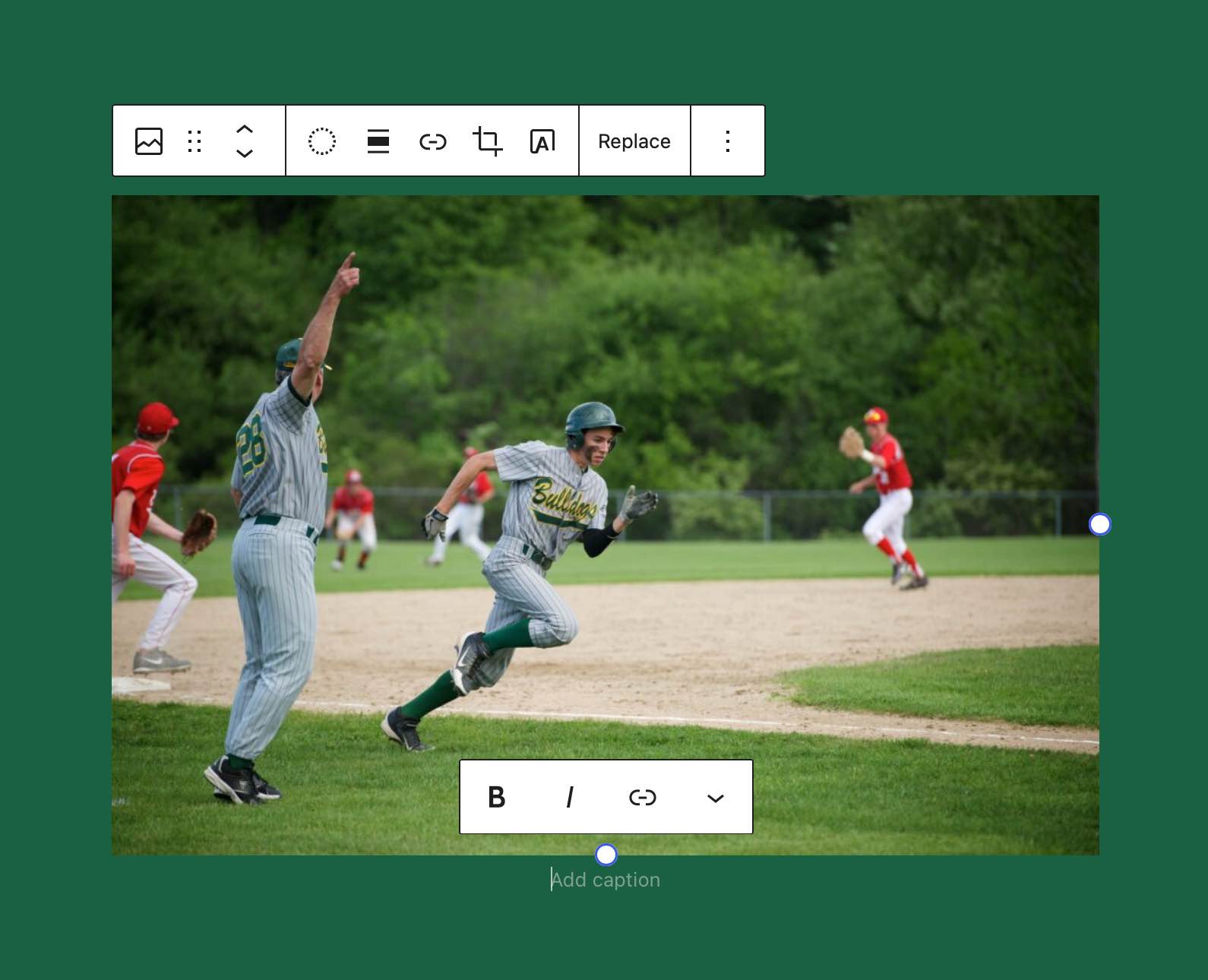
Block Toolbar
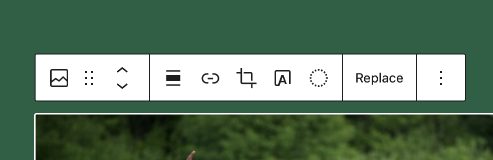 The Toolbar is anchored at the top of a block. It contains controls to quickly transform the block into other supported blocks, move the block, and any primary controls to alter the appearance of the block. The toolbar itself is divided up into several groups. These groups narrow their scope from left to right. Focusing on Block level & parent block controls first and then moving to more inline focused controls.
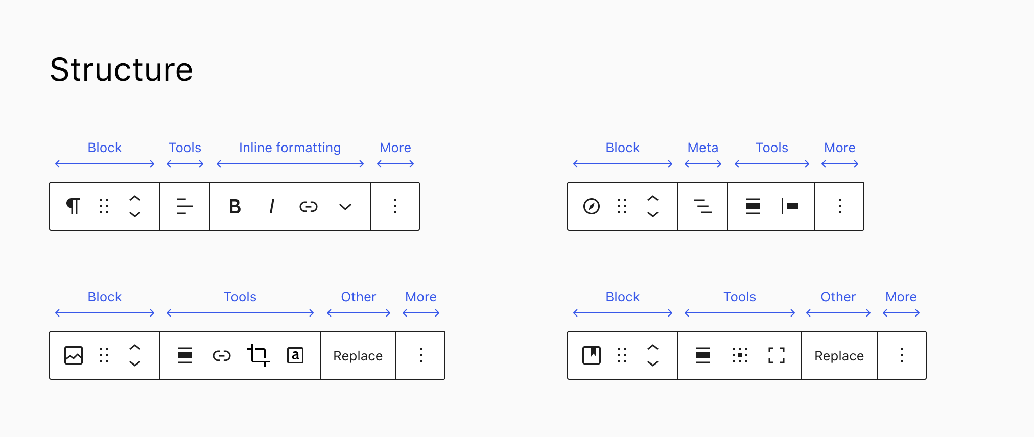
Learn more about the ordering of Toolbar Groups
When building a custom block or extending a block you can insert your items into these groups via the BlockControls component which accepts a group parameter where you can specify in which group your option should be rendered.
import { ToolbarButton } from '@wordpress/components';
import { BlockControls, useBlockProps } from '@wordpress/block-editor';
import { star } from '@wordpress/icons';

export function BlockEdit() {
    const blockProps = useBlockProps();
    return (
        <>
            <BlockControls group="meta">
                <ToolbarButton icon={ star } >
            </BlockControls>
            <div {...blockProps}>
                <h2>Hello World!</h2>
            </div>
        </>
    );
}
The available groups ordered left to right are:
parentblockinlinedefaultother
Block Content
The content of the block is an inline editable representation of the block. Depending of the state of the block it may show additional inline controls inside of the blocks content. Visually what you see should match what the user gets to see on the frontend of the site.
Settings Sidebar
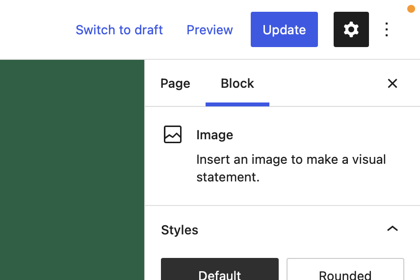
The settings sidebar housed additional secondary controls. What is placed in here should never be mandatory in order to use a block. Instead the block should operate with sensible defaults in place and if an editor wants to dig down deeper and configure more details of how the block looks & behaves this is where they can go.
The settings sidebar is split into two tabs. The "Settings" and the "Styles" tab. They only show up when the block actually has any controls that render in the respective tab.
Any controls that change the visual appearance of the block should be placed inside the Styles tab. Whilst any settings that configure settings should go into the Settings tab.
How to place controls in these locations
you can control in which location your UI should get rendered by changing the group prop of your <InspectorControls> component. The default value places a control in the main settings sidebar. Additionally there is a styles group to put controls into the styles tab. Or if you want to be more granular, each of the style sections from core also allow you to add additional settings in there like the color group for example which renders your control inside the color panel of the styles tab.
You can find all of the available groups on GitHub here: https://github.com/WordPress/gutenberg/blob/7c25dc48244c8ff0b2585c075359ef6a5868464e/packages/block-editor/src/components/inspector-controls/groups.js#L25-L39
The settings sidebar should not be the default place for every single option of the block.
States of a Block
A block may exist in several different states in the editor. Depending on what state a block is in it may display differently.
Initial Setup
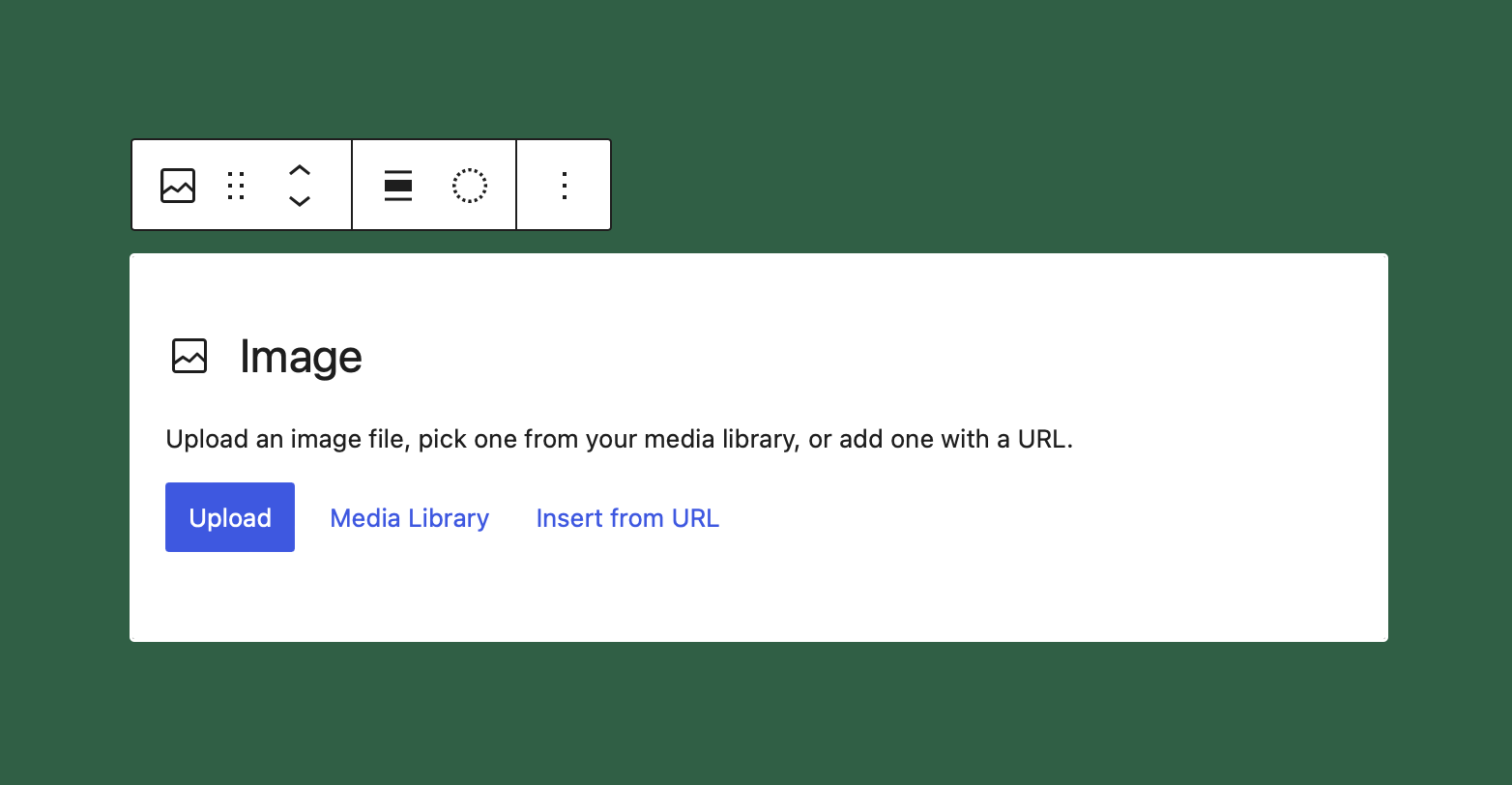
The initial setup state is one that not all blocks will or even should have. But it is a common pattern that gets used whenever a block relies on a core piece of data before it can start displaying its main interface.
A great examples of this in the core blocks for example is the cover block. The cover relies on a background image or some background color. When neither of the two is selected there is not much you can do with the block. Therefore it presents you with a placeholder to select a background image or color and once you have completed this step you are represented with all the options.
This pattern of having a placeholder also allows you to make it easier for your editors in very complex block to not overwhelm them when they start inserting the block. If you look at the core columns block the first thing you get to see is a placeholder where you can select the layout of columns you want to start with. You can of course change that easily later in the settings sidebar but you don't need to and can get up and running without having to interact with the advanced options in the sidebar at all.
This actually is a pattern that you will see over and over again throughout this section. The settings sidebar should be treated as optional. Most editors should never have to open it and interact with the options in it. Everything they need to enter their content should be available inline.
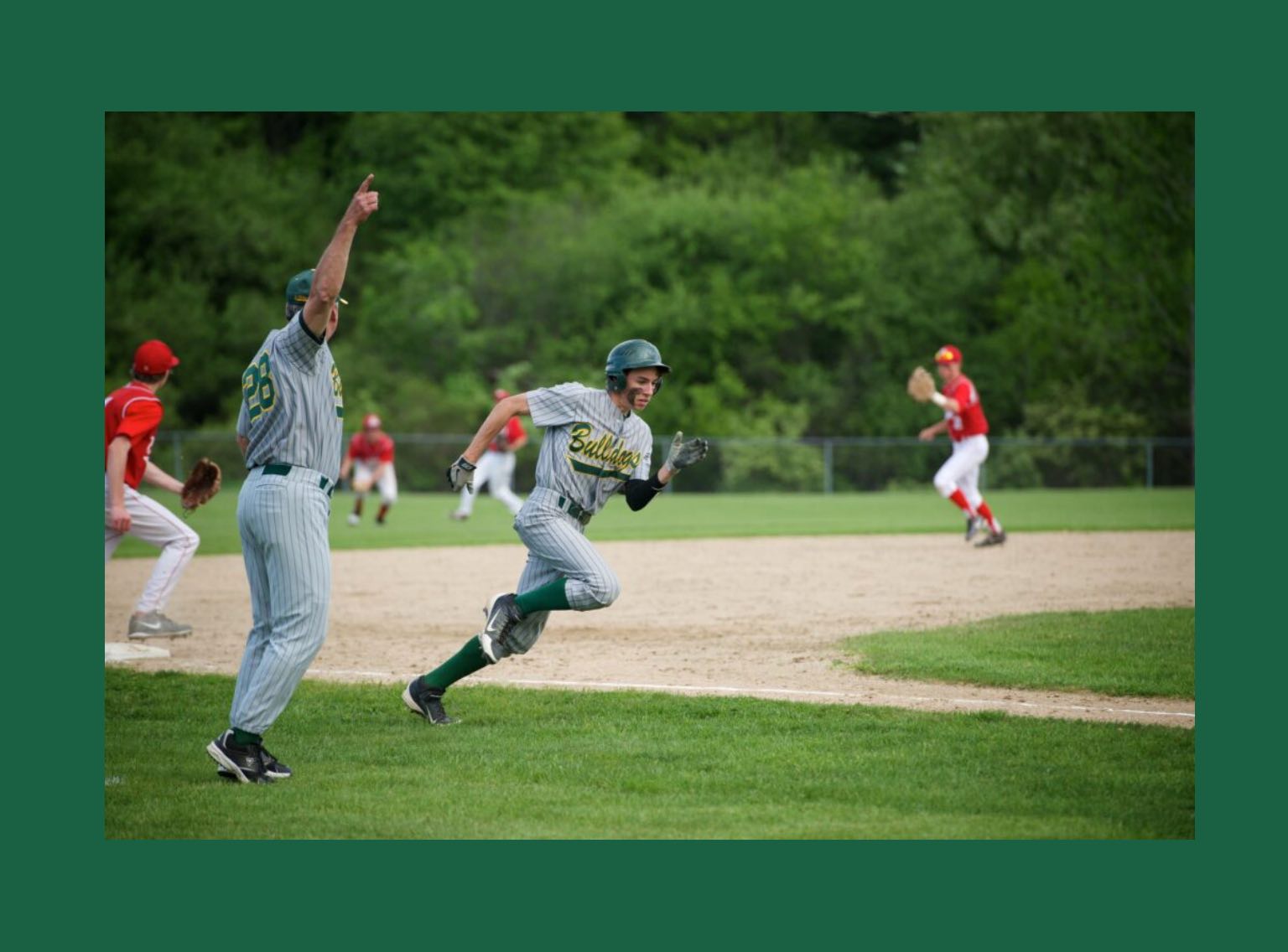
Selected
In its selected state the editor representation should be though of as the frontend representation with additional inline controls to modify the content of the block. This means that if a block for example provides different rich text areas for you to fill out they should all be shown with placeholder text. This way editors can see all the options and choose to fill in all the areas they want to.
Once they deselect the block all the fields they have not filled in will disappear and the block becomes a true 1to1 representation of how it looks on the frontend.
As an example for this you can take a look at the core image block. When the block is selected it shows you the placeholder for the image description. If you don't provide a description and deselect the block it will no longer show the placeholder.
Another key piece of the selected experience for a block is that its toolbar is shown. Editors can choose to either have the toolbar anchored to the top of the currently selected block or to the top of the editor canvas. (The default is at the top of the block)
The toolbar should provide the editor with any additional options that are commonly used.
Selected Descendent
When a block has child blocks selected it should behave the same as in its deselected state. The only difference is that there may be reasons for the parent block to provide additional options to a child blocks toolbar. You can see this pattern being used in the core columns block for example where the individual column blocks toolbar still allows you to change the vertical alignment of the overall columns block.
This is super useful for any instanced where the child blocks are very tightly coupled with the parent block and you can hereby prevent the editors from constantly having to switch between the parent and child block. Use sparingly though since it can also easily become confusing.
Deselected
As mentioned before the deselected state of a block should be a accurate representation of the frontend display. This includes font rendering, spacing within the block and in relationship to other blocks on the page. This should also be the case for the selected states but additional controls and placeholder elements may alter the spacing slightly.